
Case study · Vehicle lettering
B-Movers
From the removal lorry to the vintage van: one visual identity, down to the smallest details.
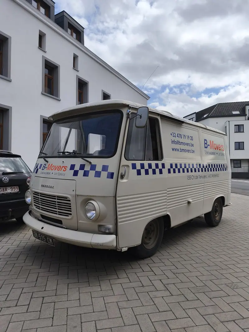
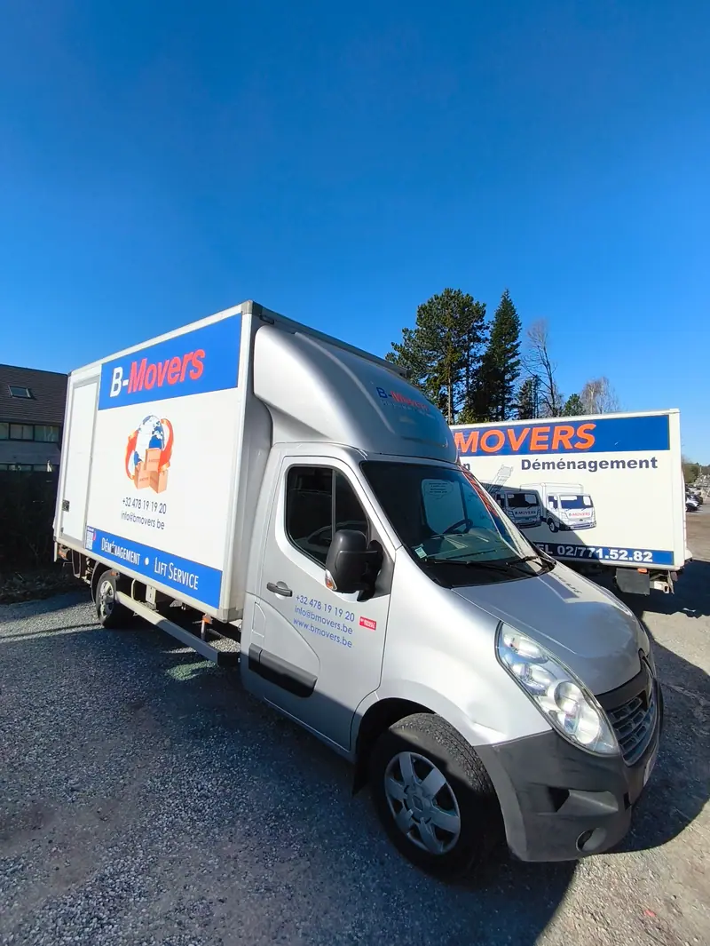
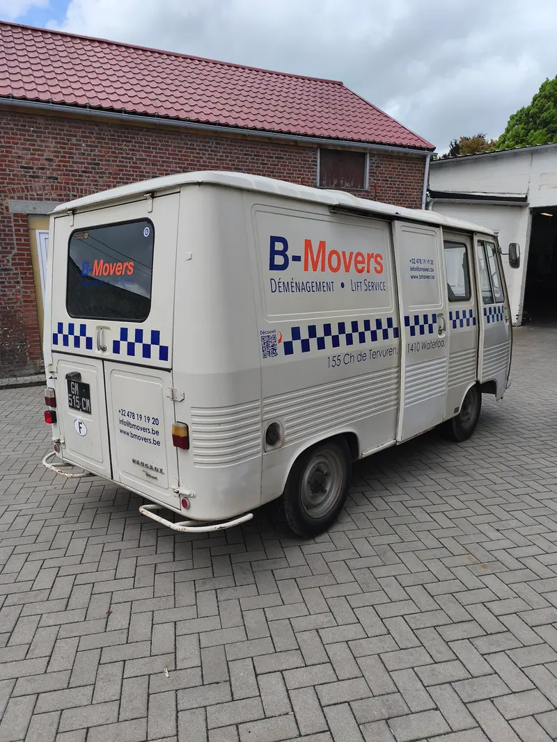
B-Movers, a Brussels removal company for over 20 years, turns its vehicles into real communication tools. Nic-nac produced the lettering for a removal lorry and a vintage van, taking care to follow the company’s brand guidelines faithfully.
Context
The challenge was to carry B-Movers’ visual identity across two vehicles with very different uses and styles: a professional lorry for everyday work and a one-of-a-kind vintage van. The aim: a consistent, polished brand image across all vehicles.
What we did
- Lorry lettering: B-Movers’ logo and graphic elements applied to a removal lorry, to strengthen the company’s visibility on the road
- Vintage van wrap: lettering and chequered patterns on a collector’s van, with particular attention to the finish
- Respect for the brand guidelines: B-Movers’ visual identity applied faithfully on both vehicles, despite their differences in style and format
The result
Two different vehicles, one visual signature. The lettering strengthens B-Movers’ presence on Brussels roads and ensures graphic consistency between the working vehicles and the vintage van.
A project that shows how careful lettering turns every vehicle into a communication tool and makes a company’s identity shine every day.
A similar project?
Tell us what you need: we’ll come back to you with clear advice and a tailored proposal.
Or call us : +32 2 315 52 50 · Monday to Friday, 9 am to 5.30 pm